
 Login
Login
Starting with YetaWF 5.4.0, CSS custom properties (a.k.a. CSS variables) are used to provide color and other CSS information for skins. This helps make components uniform and components are more easily customized to match any custom skin.

The Skin Palette can be accessed using the Skin Palette button  in the upper left of each page (provided the user has sufficient authorization).
Once the Skin Palette button is clicked, the Skin Palette is shown in the upper right of each page.
in the upper left of each page (provided the user has sufficient authorization).
Once the Skin Palette button is clicked, the Skin Palette is shown in the upper right of each page.
The Skin Palette can be used to customize all elements of a skin. A skin only implements the Default theme. All other themes are derived from the skin.
A skin customized using the Skin Palette can be saved as a theme using the Config tab. By entering a theme name and clicking the Save Button, the new theme automatically becomes available in Control Panel and can be made the current theme.
The Default theme cannot be changed or saved. It must be modified by copying the CSS variables (Config tab) into the skin CSS file which are used to define the current skin with its Default theme.
To customize an existing theme, select the desired theme using Control Panel, Skins tab. Then the Skin Palette can be used to further customize the theme and save the theme settings.
The Skin Palette can be used to generate new themes, based on just a few settings.
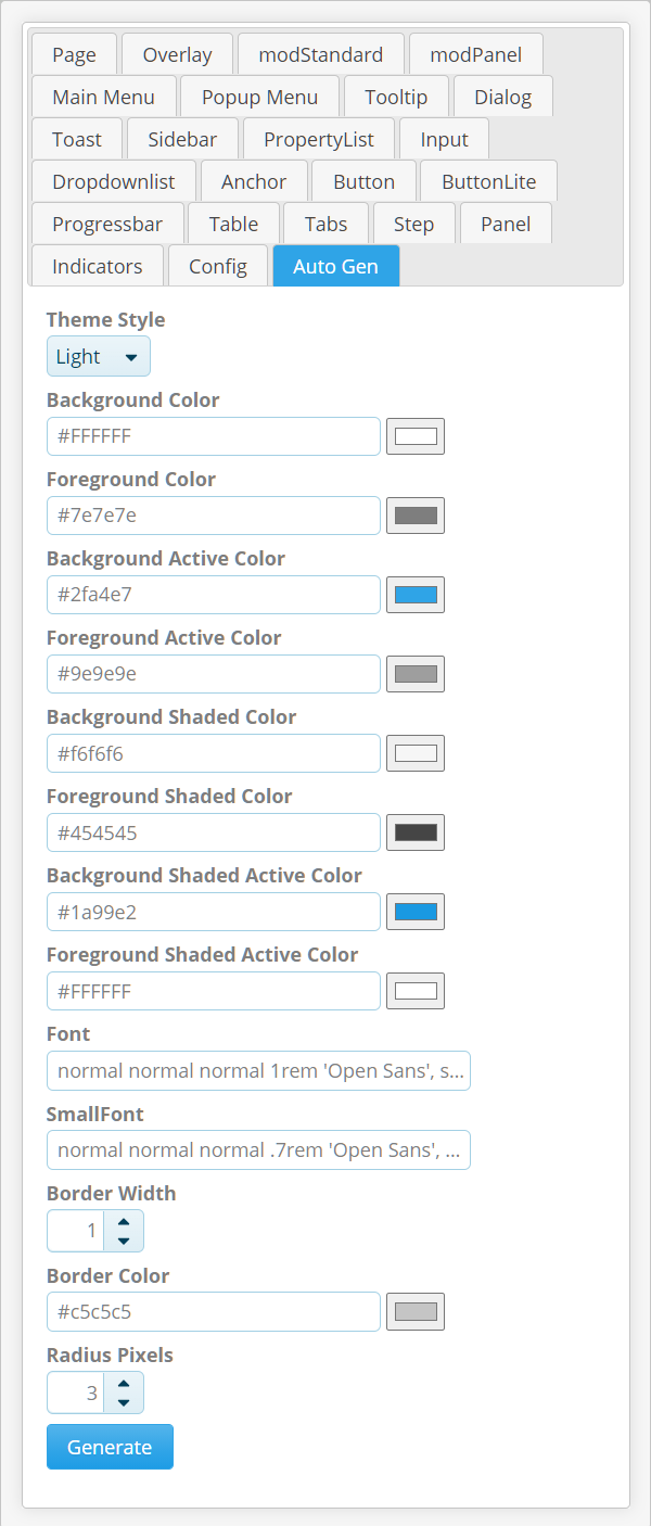
The Auto Gen tab can be used to set a few basic settings. When clicking the Generate button, all components settings (on all other tabs) are automatically updated based on the settings provided. The generated settings can be further refined manually on each tab, but generating a base can save a lot of time and insures consistency among components.
The Auto Gen tab can be used to generate Light/Dark themes. Using the Theme Style field, predefined light/dark settings can be set before generating a theme.
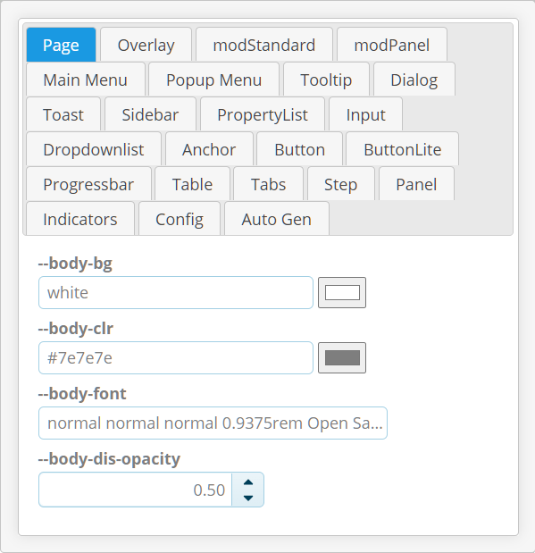
Each tab of the Skin Palette shows property settings. The CSS variable names used are shown as field captions.
CSS variable names follow a simple naming convention, where the beginning of the name indicates the component type (Popup Menu, Dropdownlist, etc.). The end of the name indicates the type of the property:
| Suffix | CSS Usage | Description |
|---|---|---|
| -bg, -bg-hover, -bg-focus, -bg-active, -bg-path, -bg-highlight, -bg-lowlight | background: | Used as background color. Accepts the full CSS background: syntax. -hover, -focus, -active background colors are used when the element is in a hover, focused or active state respectively. -bg-path is used by some components to show a parent element's connection with active child elements. -bg-highlight, -bg-lowlight is used by some components to highlight or dim certain elements. |
| -clr, -clr-hover, -clr-focus, -clr-active | color: | Used as foreground color. Accepts the full CSS color: syntax. -hover, -focus, -active colors are used when the element is in a hover, focused or active state respectively. |
| -border, -line, -border-hover, -border-focus, -border-active | border: | Used as border definition. Accepts the full CSS border: syntax. -hover, -focus, -active border colors are used when the element is in a hover, focused or active state respectively. A -line property represents a line, i.e. a border without border radius. |
| -border-radius | border-radius: | Used as border radius definition. Accepts the full CSS border-radius: syntax. |
| -font | font: | Used as font definition. Accepts the full CSS font: syntax. |
| -opacity | opacity: | Used as opacity definition. Accepts a value between 0 and 1.0 (inclusive). |
| -padding | padding: | Used as padding definition. Accepts the full CSS padding: syntax. |
| -padding | padding: | Used as padding definition. Accepts the full CSS padding: syntax. |
| -margin | margin: | Used as margin definition. Accepts the full CSS margin: syntax. |
| -height, height | height: | Used as height definition. Accepts the full CSS height: syntax. |
| -width, width | width: | Used as width definition. Accepts the full CSS width: syntax. |
| -shadow | box-shadow: | Used as box-shadow definition. Accepts the full CSS box-shadow: syntax. |
| -dec, -dec-hover, -dec-focus | text-decoration: | Used as text-decoration definition. Accepts the full CSS text-decoration: syntax. -hover, -focus text decorations are used when the element is in a hover or focused state respectively. |
 On
On Off
Off